If your site’s not helping you get more leads or paying clients, it’s much more likely that you don’t need to add anything to your site, but you do need to get rid of some things.
Things that are confusing your visitors, pulling them away from where you want them to go, and in some cases, just scaring them off.
So in this article, I’m going to share the seven things that you need to remove from your website right now, why each is ruining your ability to get clients, and what works way better so you can keep more of your site traffic where they can quickly turn into paying customers.
Crazy Color Scheme
If you want to make your a site, but you don’t have that designer’s eye, and you don’t want their site to be boring, you’ll end up choosing either too many colors or the colors you do choose are just used wrong, so it ends up looking way more homemade than it should.

It’s not just about what we can do. It’s about having the instinct to pull back, to edit, because even if you can’t pinpoint why something’s off, you can still feel it, and that gut feeling can make people second guess the credibility of your business.
Use color more subtly like:
- Buttons
- Headlines
- Icons
That’s where your color should pop out against you know more neutral backgrounds.
A website really should guide visitors where you want them to pay attention, not overwhelm them with color.
You want attention to your call to action, your persuasive words, and your testimonials.
Choose a few colors that align with your brand and use them to highlight what you want your customer to see.
Complicated Menu
If you’ve ever landed on a website and didn’t know where you should go or what you’re supposed to do, that’s a problem.
When your site visitors feel like that, guess what? They’re not gonna waste their own time figuring it out, they’re just gonna leave.
So your site isn’t a place for visitors to just wander around aimlessly.
It’s about leading them straight to why they’re there in the first place, which is to see if they wanna work with you.
And the way to do that is to get rid of your complicated menu.
I find the magic number for menu items is five. It helps cut through the clutter to give them a really clear path.
So what you want to do instead is keep your navigation nice and simple and only include the pages that people would need to see to want to become a customer.
Everything else can be found somewhere else on your site, usually down in the footer menu where people who want to find them can.
Self Indulgent Wording
So if your website uses mostly self-indulgent wording that can look like bragging about how good you are, or if you’re leaning on corporate jargon, or if you’re just making it all about you, you’re off track.
You may think that this is what being professional looks like, but trust me, it isn’t clicking with your audience.
Here’s what you should do instead. Rather than making it all about how awesome you are as a business, turn your visitor into the hero.
Talk about their challenges and how you can guide them toward getting them solved.
And keep it simple, as if you’re explaining it to an eighth grader. No need for big words. You know, honestly, the biggest, most successful companies in the world know not to sound like mega corporations on their websites. They keep their language super relatable because it works.
Albert Einstein nailed it when he said:
“If you can’t explain it simply, you don’t understand it well enough.”
-Albert Einstein
So by using easily understandable words on your website, it helps your audience see that you’re the expert they need without making their heads spin.
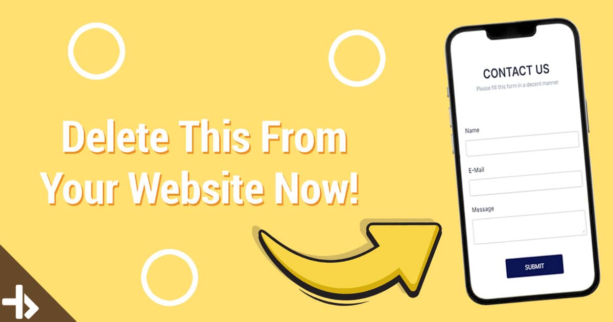
Traditional Contact Form
Why should you remove yours? Well, because they’re usually super vague about what happens after someone hits submit.
Do they just wait for an email back or a call that might come when they’re in the middle of something else?
It’s all just a bit mysterious. And that mystery is a huge turnoff. People want to avoid doing anything when they’re not sure about what comes next.
It’s inefficient, everyone’s looking for clarity and convenience, and it just doesn’t cut it anymore.
Here’s what I found works much better.
So if you’re trying to book consult calls, appointments, or anything like that, plug in a direct calendar booking tool like Calendly right on your website.
The way it works is visitors can see exactly when you’re available and then they book themselves in for a time that works for them and for you.
No tedious back and forth is necessary and it just cuts out all the guesswork.
They know exactly what to expect, and when it’s clear and efficient, it’s way more likely that they’re gonna take that next step toward working with you.
Your Social Media
If you wanna be sure that they’ll take that next step, you’ve got to remove your social media from your website.
Usually, your social media is up at the very top of your sales funnel. It’s where people probably first find you, then they get interested in you. And they decide they wanna know more.
And as they move deeper into your funnel, that’s where they hit your website where you’ve got the home court advantage.
This is where you control the narrative and you set the scene and you gently nudge them closer to making a purchase.
So why then would you want to distract them and send them back to your social media with buttons like these in the top navigation or your Instagram feed plastered all over your homepage?

It’s just asking for them to take a step backward in the sales journey.
Because once they’re on your site, you wanna keep them there, engaged with your content, learning about your services, and moving toward a decision.
Believe me, you don’t wanna get a new follower at the expense of losing out on a potential customer.
Obvious Stock Photos
Stock photos are something that can seriously just suck out so much of the authenticity of your business, and that is all of the overly posed, exaggerated stock photos on your website.

And these images might fill the space on your site, sure, But they also make your site just feel staged and completely disconnected from the experience of working with this business.
When people can just tell it’s stock, especially when it’s bad stock.
They’re going to start to subconsciously wonder what else here isn’t real.
You know, there are promises, there are reviews, and that’s a road you just don’t want to go down.
But not everyone has the budget for a professional photo shoot. The good news is you don’t have to have one.
You can still use stock photos or even better, create AI generated ones using something like Midjourney.
The trick here is to either pick or create images that feel natural and capture the feeling that your customers have after working with you.
Now, I recommend going for more satisfied looking expressions and just aiming for the higher quality images that don’t scream stock photos.
Pro tip
So real locations typically feel more authentic than those with just like the plain solid background like that.
These just add kind of a layer of realism to the story that you’re telling. But most importantly, when it comes to your About Us page.
You need to get rid of stock photos that are meant to be you or your team.
People need to see that there are actual humans behind the business.
People value doing business with real people and they need to feel like those real people are here somewhere.
So if visitors come and they think that you’re using stock photos to represent your team or your work, it’s like you’re hiding. And guess what? That makes them trust you less.
Team Bios
And while it’s true that you wanna give people a glimpse of the real humans behind your business, you don’t wanna go too far in that direction and make it all about you and your team.
So if you have a team, you should definitely remove these team bios from your site.
You know, the ones that dive deep into everyone’s likes and dislikes and maybe even their favorite pizza toppings.
While it is cool to celebrate your team and make them feel seen on your site, your clients don’t care.
When you start winking out to every team member’s social media, that is just another detour off the path that you want them on.
So instead of laying out that grid of bios, why not just keep it simple with a really nice group shot on your About Us page?
So it shows that there are real smiling people behind your work without leading your potential clients on a wild goose chase.